Why a Design System?
Seven posts into building PriceGuess, the app was feature-complete but visually inconsistent. Colors were hardcoded across 30+ files. Dark mode didn't exist. Changing the brand color meant a find-and-replace nightmare. I needed a proper design system - a single source of truth for every color, shadow, and spacing value in the entire app.
This post covers the biggest visual overhaul I've done to PriceGuess: rebranding from red to blue, building a CSS custom properties system, adding dark mode, and creating a live preview tool that lets me edit every design token in real time. Plus, I built an interactive demo you can play with right here in this blog post.
The Rebrand: Red to Blue
PriceGuess originally used a red/rose color palette. It worked, but red carries a lot of semantic meaning in a game - it means "wrong" or "far away." Having your brand color be the same as your error color is confusing. Blue is calmer, more trustworthy, and doesn't clash with the game's feedback system.
❌ Before (Red Brand)
Brand = Error = Same color. Confusing!
✅ After (Blue Brand)
Brand is distinct from error states. Clear!
The tricky part was doing this across 25+ files without breaking semantic colors. "Far" indicators must stay red. "Near" stays amber. "Correct" stays green. Only the brand elements - buttons, headers, active states - should be blue. I learned this the hard way when a mass find-and-replace turned every error indicator blue, and players couldn't tell what was wrong anymore.
CSS Custom Properties: The Token System
Instead of scattering Tailwind color classes everywhere, I created a theme.css file with semantic design tokens. Every color in the app maps to a CSS custom property with a meaningful name:
/* theme.css - Light mode (default) */
:root {
  --color-primary: #2563eb;
  --color-primary-hover: #1d4ed8;
  --color-bg-page: #f8fafc;     /* NOT pure white */
  --color-bg-card-solid: #ffffff;
  --color-text-primary: #1e293b; /* NOT pure black */
  --color-text-muted: #94a3b8;

  /* Status colors - semantic, not brand */
  --color-correct: #059669;
  --color-near: #d97706;
  --color-far: #dc2626;
}

/* Dark mode overrides */
.dark {
  --color-primary: #60a5fa;     /* Lighter blue for dark bg */
  --color-bg-page: #1e293b;     /* NOT pure black */
  --color-bg-card-solid: #334155; /* Lighter = elevated */
  --color-text-primary: #e2e8f0;  /* NOT pure white */
}
Two critical design rules I followed:
- No pure black or white. Pure
#000on#fffcauses eye strain. Off-white (#f8fafc) and deep slate (#1e293b) are much more comfortable. - Dark mode elevation = lighter surfaces. In light mode, elevated cards are white with shadows. In dark mode, elevated cards are lighter gray than the page background. No shadows needed - the lightness difference creates the depth.
The Token Architecture
I organized tokens into five groups, each serving a distinct purpose:
| Group | Light | Dark | Purpose |
|---|---|---|---|
| Brand | #2563eb | #60a5fa | Buttons, links, active states |
| Surfaces | #f8fafc | #1e293b | Page, card, elevated backgrounds |
| Text | #1e293b | #e2e8f0 | Primary, secondary, muted text |
| Status | Correct / Near / Far feedback | ||
| Borders | #e2e8f0 | #475569 | Card edges, dividers |
Interactive Demo: Play With the Theme
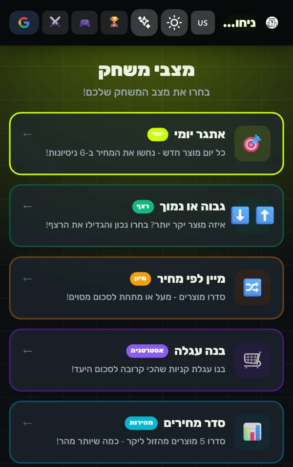
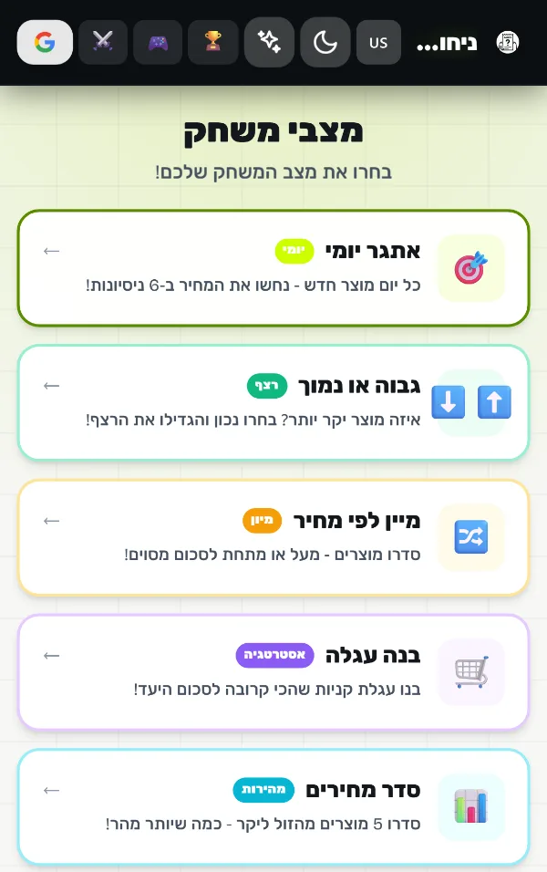
This is the fun part. Below is a miniature version of the PriceGuess theme system. Change the colors, toggle dark mode, and watch everything update in real time. This is exactly how the /preview editor works in development mode on the actual site.
Try switching to dark mode and notice how the card becomes lighter than the page background. That's the elevation trick - in dark mode, lighter surfaces feel closer to you, just like shadows create depth in light mode.
The Anti-FOUC Script
One notorious problem with dark mode: the flash of unstyled content (FOUC). If your page loads in light mode and then JavaScript kicks in to apply dark mode, users see a blinding white flash. The fix is a tiny inline script in <head> that runs before the first paint:
<script is:inline>
  (function() {
    var t = localStorage.getItem('priceguess-theme');
    if (t === 'dark' || (!t && matchMedia(
      '(prefers-color-scheme: dark)'
    ).matches)) {
      document.documentElement.classList.add('dark');
    }
  })();
</script>
This script is synchronous and blocking (intentionally). It reads the user's preference from localStorage or falls back to the system preference, and applies the .dark class before the browser renders a single pixel. No flash, ever.
The Live Preview Editor
For development, I built a full-featured theme editor at /preview. It reads every CSS custom property from the computed styles, groups them by category (Brand, Surfaces, Text, Status, Borders), and lets you edit each one with a color picker. Changes apply instantly via document.documentElement.style.setProperty(). When you're happy with a palette, you can export both the light and dark theme as CSS and paste it into theme.css.
The editor also has a live preview section that shows how all the tokens look together - page background, card elevation, text hierarchy, status colors, and buttons. It's the fastest way to iterate on the design without touching code.
i18n: Externalizing Every String
While I was refactoring colors, I also pulled every hardcoded Hebrew string out of the components and into a central he.json file. A tiny utility function t() handles lookups with dot-notation paths and variable interpolation:
// Usage in React components
import { t } from "../i18n/t";

// Simple lookup
t("game.won")        // "כל הכבוד! ניחשת נכון!"

// With interpolation
t("game.lost", { price: "14.90" })
// "המחיר היה ₪14.90"
This makes the app ready for future localization (English mode, anyone?) and means every string change is a single JSON edit, not a hunt through 30 components.
The Shared Layout
Before this overhaul, every .astro page duplicated the full HTML structure: <head>, navigation, footer, meta tags. I created a BaseLayout.astro component that handles everything:
- RTL Hebrew setup (
lang="he" dir="rtl") - Dark mode anti-FOUC script
- Gradient header with logo, navigation, theme toggle, and login button
- Gradient footer with links and feedback mailto
- Props for
hideHeader,hideFooter, and custommaxWidth
Every page went from ~80 lines of boilerplate to a single <BaseLayout title="..."> wrapper. The 1v1 game room uses hideHeader and hideFooter for a full-screen immersive experience.
Lessons from the Rebrand
- Semantic colors are non-negotiable. Your brand color and your error color must be different. Red brand + red error = user confusion.
- Mass find-and-replace is dangerous. When I swapped all red to blue, I broke every "far/wrong" indicator. Always audit semantic usage before a bulk change.
- CSS custom properties > Tailwind classes for theming. Tailwind is great for utility-first styling, but design tokens should live in CSS variables. Changing a single variable updates every component instantly.
- Dark mode isn't just "invert the colors." It requires different shadows (or none), lighter elevated surfaces, desaturated accent colors, and careful contrast ratios. Follow the guidelines, don't wing it.
- Build a preview tool. If your design system is worth building, it's worth making editable. A live editor saves hours of compile-refresh-check cycles.
What Changed
Here's the scope of this update in numbers:
- 78 files changed in a single commit
- 12,287 lines added across components, pages, utilities, and styles
- ~50 CSS custom properties (24 light + 24 dark + shared)
- 200+ i18n strings externalized to JSON
- 15 pages refactored to use the shared layout
- 0 hardcoded Hebrew strings remaining in React components
PriceGuess Israel is live at price.etiel.dev. Try toggling dark mode, playing a daily game, or challenging the bot to a 1v1. And if you're a developer, visit /preview in dev mode to see the theme editor in action.